Collective Experience Case Study
Delivered brand strengthening and UX improvements as a freelance collaborator on a website redesign for S+C Partners, a chartered professional accountants firm.
While freelancing for Collective Experience, I collaborated on a website redesign for their client, S+C Partners, a chartered professional accountants firm.
My role involved strengthening their brand and solving for areas of improvement identified by the team's research.
How might we design the client's website so users effortlessly discover and choose the services that best fit their needs, prompting them to convert into customers?
Discovery
I reviewed the team's research outcomes to understand the redesign's requirements, target audiences, business goals, competitive advantages, and key focus areas. The team had conducted:
To align stakeholders on project plans, milestones, goals, and requirements.
To help the team and client understand their key audiences, user priorities, and user goals.
To understand the market landscape, competitive strengths & weaknesses, and opportunities.
To foster empathy amongst stakeholders by mapping out the experience and users' thoughts, feelings, priorities, and touchpoints.
Target audiences included entrepreneurs and private corporations in sectors like construction, manufacturing, and distribution.
Financial advisory, tax minimization, profitability optimization, and managing financial commitments were the top priorities for users.
Hard to find information and low task completion rates stemmed from cluttered navigation, lack of mobile-friendliness, and poor readability.
Users did not perceive the firm as a distinct or competitive option compared to competitors offering similar services.
Define
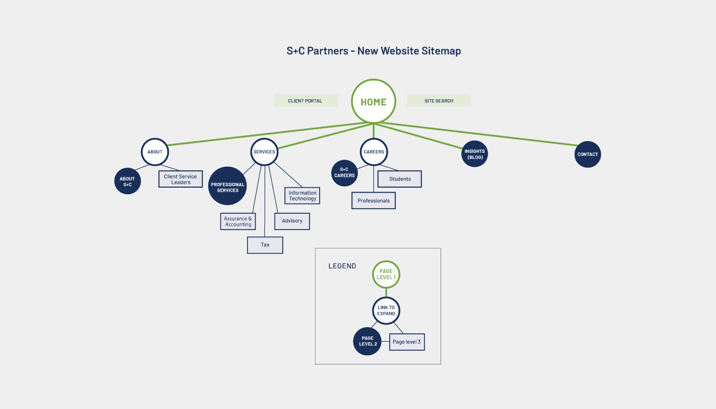
To understand the old website's navigation, I analyzed its information architecture using a sitemap. We learned that the website had significant structural problems, and used competitive prioritization to define what to fix.
The site's primary navigation was overly complex, often running 4–6 levels deep with additional in-page secondary and tertiary navigation.
Many pages were unlisted in the main navigation, accessible only through links buried within the body copy.
We conducted affinity mapping of the site's topics into categorical clouds, evolving these into a new sitemap to identify and extract the most valued categories.
Define
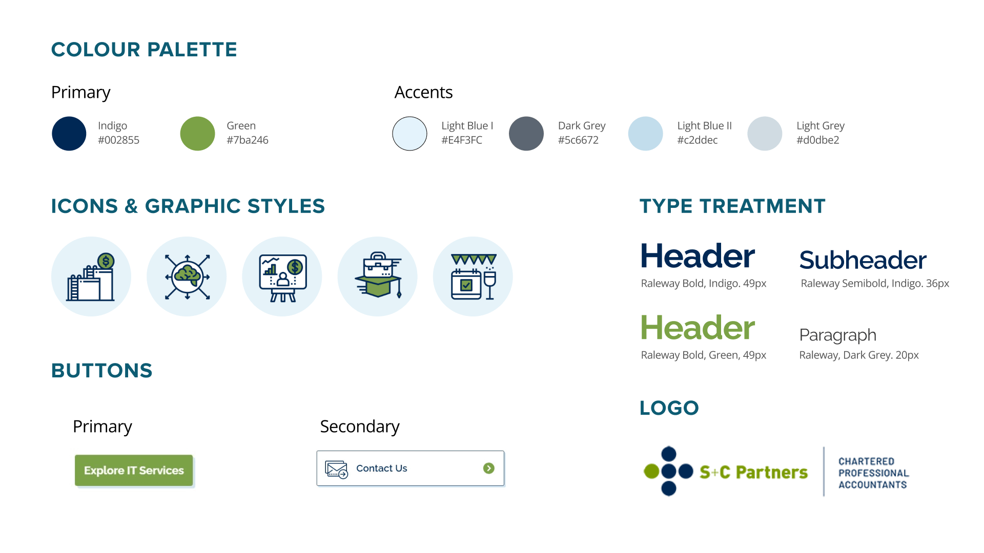
S+C Partners also needed a complete set of branding guidelines to resolve inconsistencies in their marketing collateral and website, and to build a stronger visual representation of their brand. Agreeing to resolve this first, we consolidated everything we learned into a brand identity set through a process of brainstorms, visual references, mood boards, client touchpoints, and collateral mockups.
Ideation
Once S+C Partners approved the final branding, I conceptualized the website pages, progressing from lo-fi wireframes and design reviews to hi-fidelity prototypes.
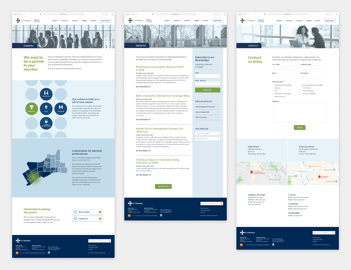
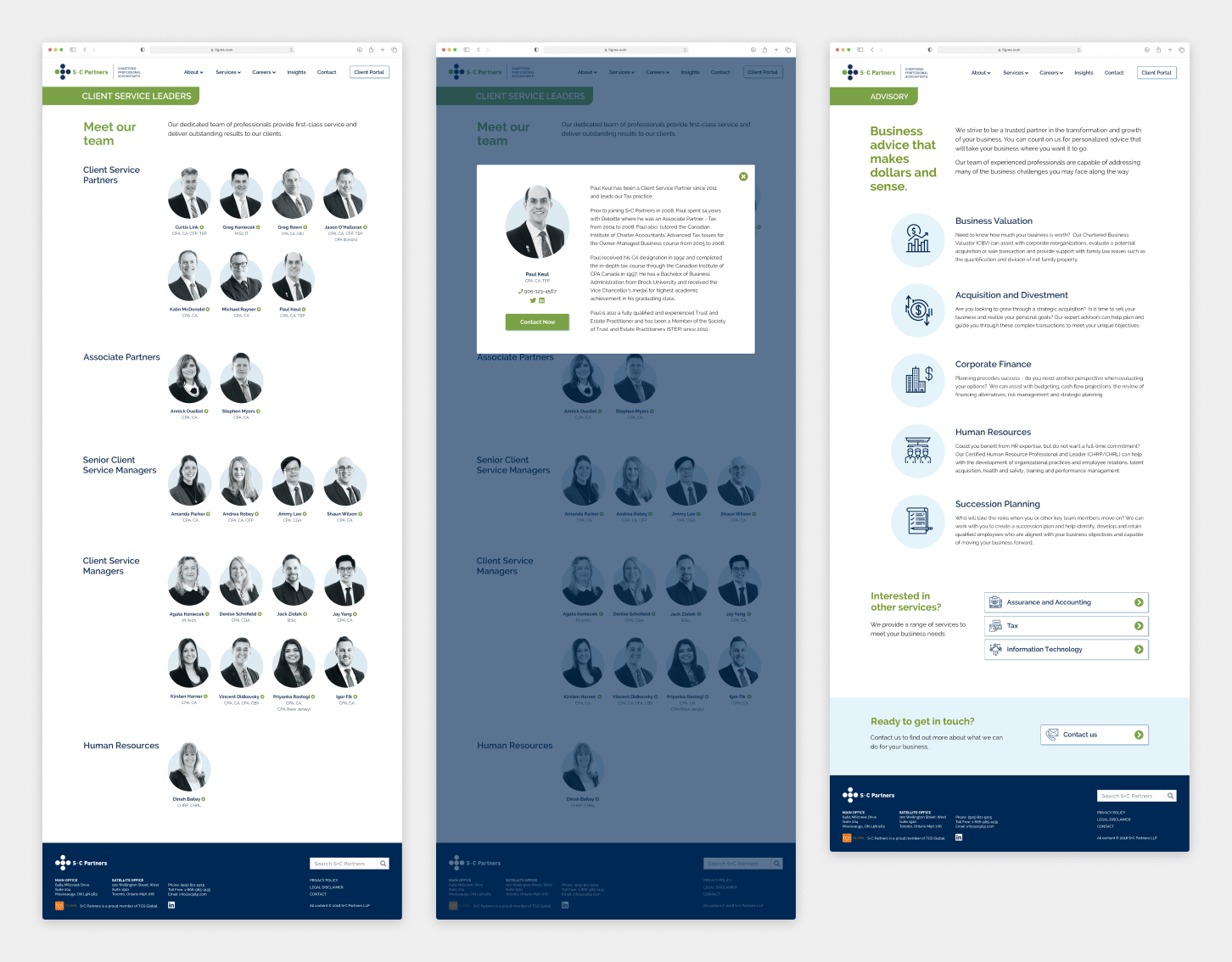
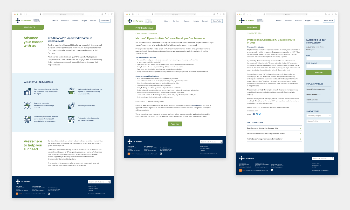
Design
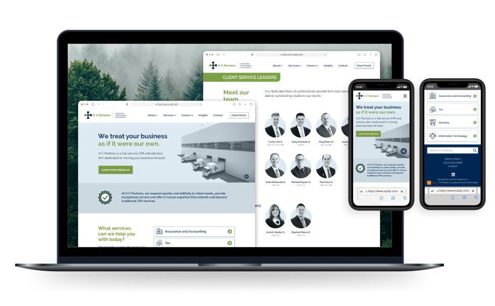
These are some examples of changes applied after testing during the refinement stages.
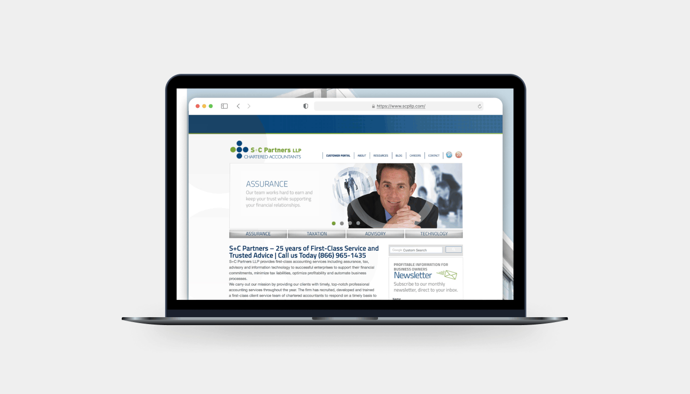
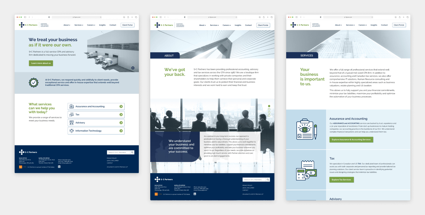
Before
Users found the opening vague, unclear about S+C Partners' identity. The four key services were also not obviously clickable.
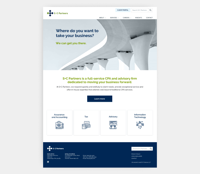
After
I worked with the content writer to state S+C Partners' purpose, converted the four key services into prominent buttons, and moved critical text above the fold to encourage scrolling.
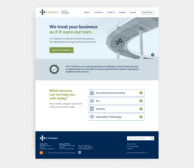
Before
Users noted a disconnect between photography and page content, and found it difficult to identify individuals or know whom to consult.
After
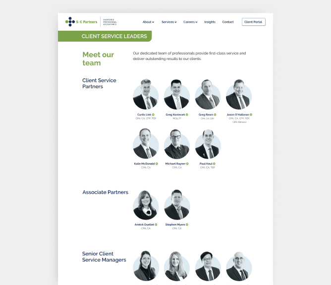
I reduced decorative photography, added individual qualifications, and used clear visual indicators to highlight clickable profiles for each person.
Before
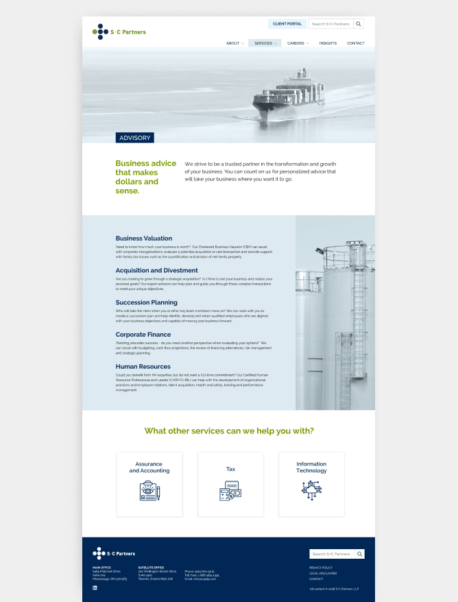
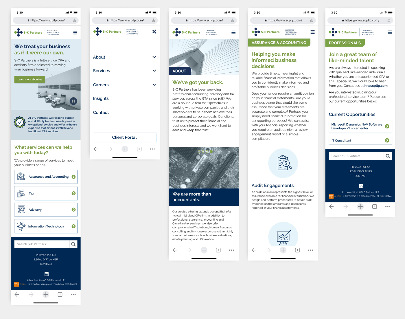
Users found the copy too small. S+C Partners also wanted to upsell their services and increase client contact.
After
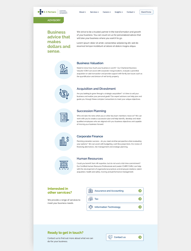
I added icons to accompanying text for improved readability. To increase client contact, I added an "Ready to get in touch?" section to the bottom of pages with a "Contact us" CTA.
Design
Design
Design
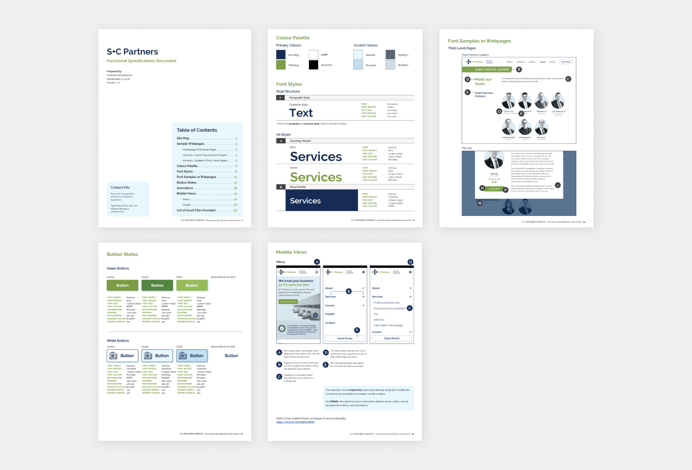
Development
As a best practice at the agency, I created a specifications document for our external developers. These docs detailed page types, layout, color guides, and font specifications for both web and mobile. Doing so significantly improved our collaboration during development, since developers had a shared reference to use as they began their work.
Development
Once the development agency provided staging links, I assisted with auditing accessibility compliance, from alt tags to font sizing and colour contrast. Any feedback was left for developers to achieve design accuracy.
Impact
The outcomes were increased contact rates and a clean, modern, AODA-compliant website with significantly improved findability, readability, accessibility, and brand presence. S+C Partners also gained a new set of branding guidelines to use going forward for all their visual and digital needs, which they are still using today.